13 Apr END SLATE – WHY IT MATTERS AND HOW TO DO IT CORRECTLY
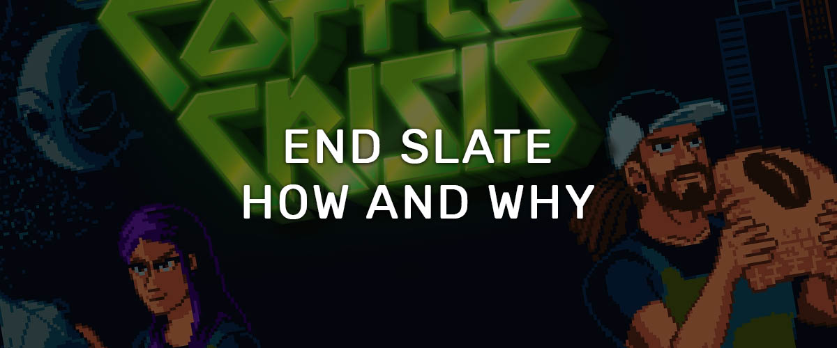
The end slate, this little card wrapping up every game trailer, is the cherry on the cake where your audience will get the last glimpse of your identity and the information they need, to proceed forward.
Some trailers also choose to make two cards (or more), the first containing the logo of the game, and the next displaying all the information related to the game. We will talk about it in the last chapter.
The main role of the end slate is providing information, about the game and its state of development. Positioned at the end of the trailer, it has the difficult mission to ease out all the emotion built over the previous minute(s), and to finish on a good note. At this point, since it is the last thing a viewer will see, it needs to be visually appealing and in accordance with your game art. Like a climax and a resolution in a story, it has to conclude and make sense of what happened before.
There are many informations you can present, in various order and design hierarchy. Always keep in mind what you want to communicate in priority, although players don’t especially want to know everything, the bare minimum they are interested in is in bold :
- Name of the game
- Allow them to talk about the game and recognize it by the name.
- Platforms & Consoles (shop)
- Knowing if they are the targeted audience. Not everyone has all the consoles.
- Gives a place to get more information about the game, directly on the platform.
- Social Media logos and names (@FireEmblem, #TheWitness”)
- Growing your social awareness
- Studio/Company/Publisher/Partners logo
- Considerate if you are legit or not
- Get to know your brand
- Website address
- The game website, studio website, personal website
- Date (release, Kickstarter…)
- What is the state of the game? Is it a beta? in development?
- Informational subtext (availability, sub-sentence, describe the game, ajoke, empowerment tag)
- Personality touch, avoiding generic stuff like “A new game like Dark Souls” or “The best rogue-like ever!”.
If you upload your trailer with logos of companies, you might want to add a trademark at the bottom.
Don’t think of the end slate as a distinctive piece stitched to the trailer, instead, consider it as the last shot, the continuity of what preceded it. It means that it needs to follow a few design ideas:
- Represent the identity of the game, like a main menu does or the header of your website/twitter/facebook/storepage.
- Readable, with enough space and scaled to the right proportion. Follow some design hierarchy principles like opacity, scale, shape, contrast…
- Pleasing to the eye.
One simple little trick is to follow your instinct when it comes to decide if you lock the design you just made. Do you think there is something off somewhere but you can’t exactly tell what it is? Take a moment, ask your (designer/visual artist) friends, try to deconstruct what feels weird so you can fix it. Turn off, one by one, each layer to find out what is the problem.
Animation-wise, you have plenty of possibilities to make it pop. You may want to create a smooth transition that will feel invisible, using alpha backgrounds and perspective hacks (Remember those transition, when a big logo come from the camera like Harry Potter? you didn’t see that coming!). Animating separately each layer of the background is a great way to create a world that feels alive.
A simple CTA can do wonderful things. Ask gently, and people will gladly help you out. When a Youtuber ask his community to like the video, the numbers increase, but it has to be done wisely and not in a needy or pushy way. The great thing is that players are accustomed to seeing the same pattern of CTA, in the way a trailer convey it.
By nature, the end slate is a general call to action, but it is not as obvious as “Share the video!”. To illustrate, when you add the Nintendo Switch logo at the end of your trailer, it smoothly generate the idea that the viewer should check your game on the Nintendo shop. So does a Twitter logo with its username or the release date.
Call to action example:
- Visit our social media account – Showing the twitter/facebook/vk logo+tag
- Visit our store page and get more information – Showing personal store page, steam, unreal, gog logo/link
- Visit our website / Subscribe to our newsletter – Link or subtext
- Come back on “Tuesday 5 December!” – Subtext
Although there is not a right answer to it, you have the possibility to make one or more cards consecutively. One for the title, then one for the date release and one more for the website. It comes to preference and what fits best to the rhythm, design and expectations. Showing the logo big and clear, allow the viewer to focus clearly on the name and art of your logo, so you can create a clearer memory in the brain of your audience. When all know the Nike and Apple logo, did you notice the way they show it? It is, most of the time, plain design without anything around to bother the focus on the logo. Just a logo and a background, nothing more. You can argue that this type of logo are timeless and well designed, contrary to a game logo that sometimes feels very specific and stylized. It doesn’t take off the effect of showing a logo by itself: the focus we gave to it. This is one more way to be rememberable.
When you use one card, you have to fit every single part into the screen. This is problematic when you have the game logo, 6 company logos, subtexts, a date and other background art with characters you would like to showcase. You have a limited amount of space that need to be well thought to be readable, appreciable and feels well designed in harmony with your game art. Using two cards, can separate the informations into his own category without taking a risk in the overflood of information.
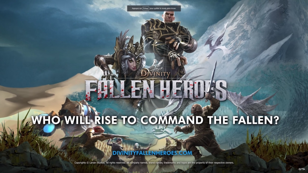
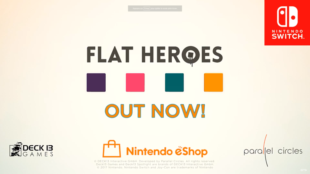
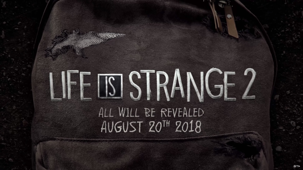
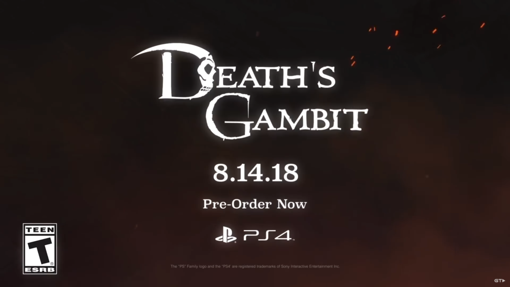
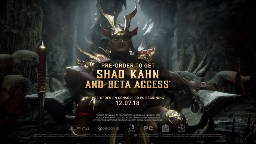
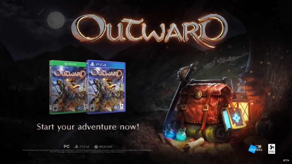
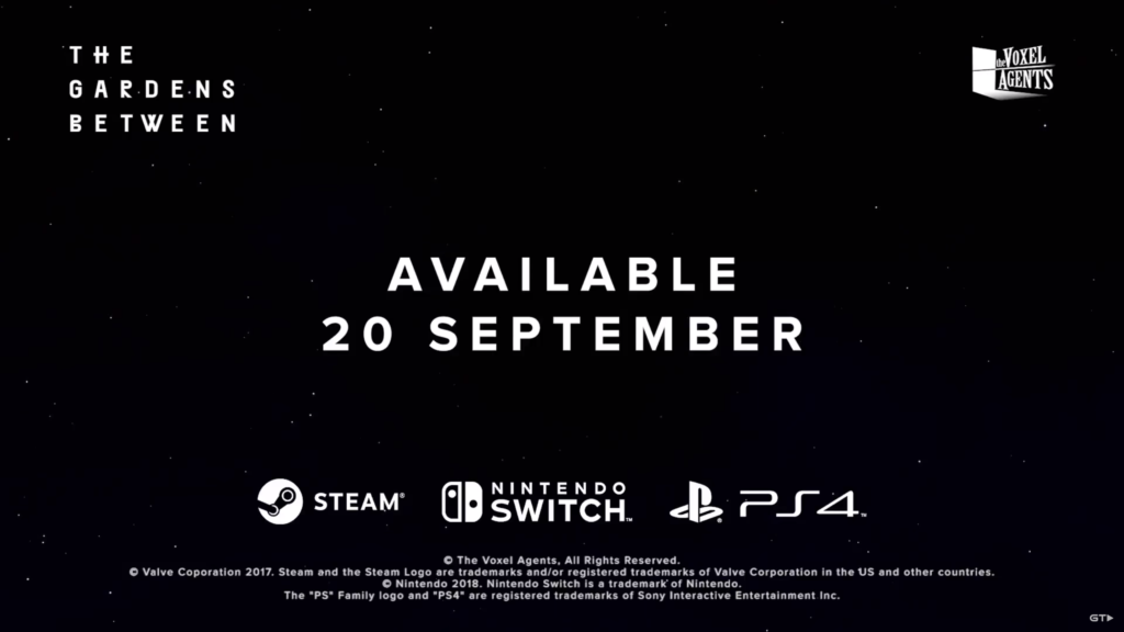
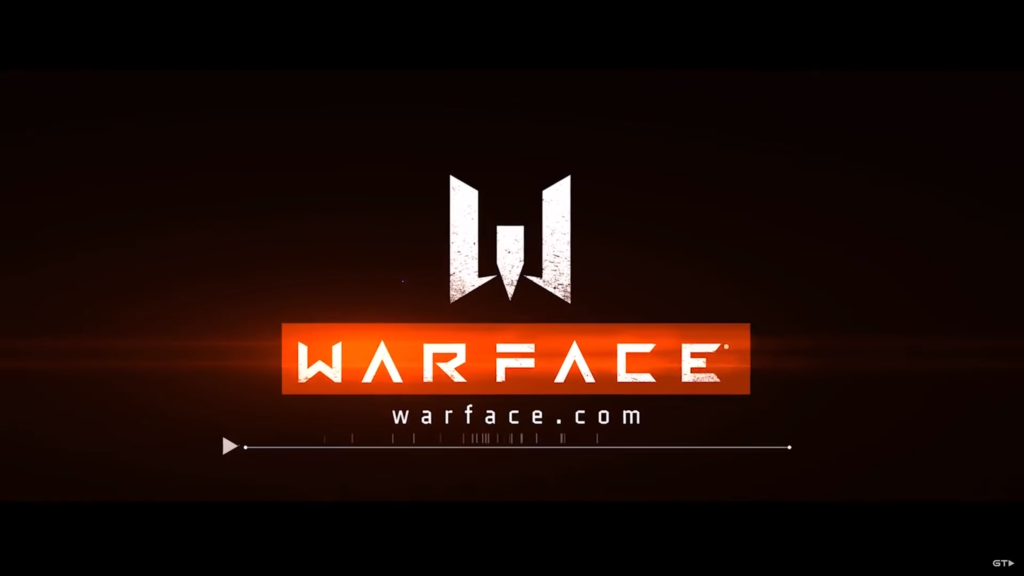
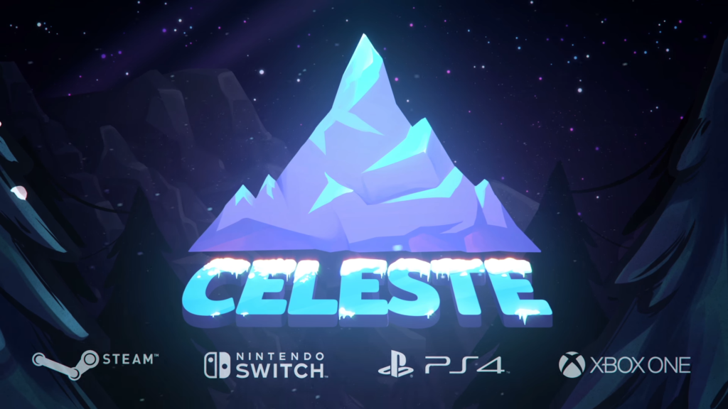
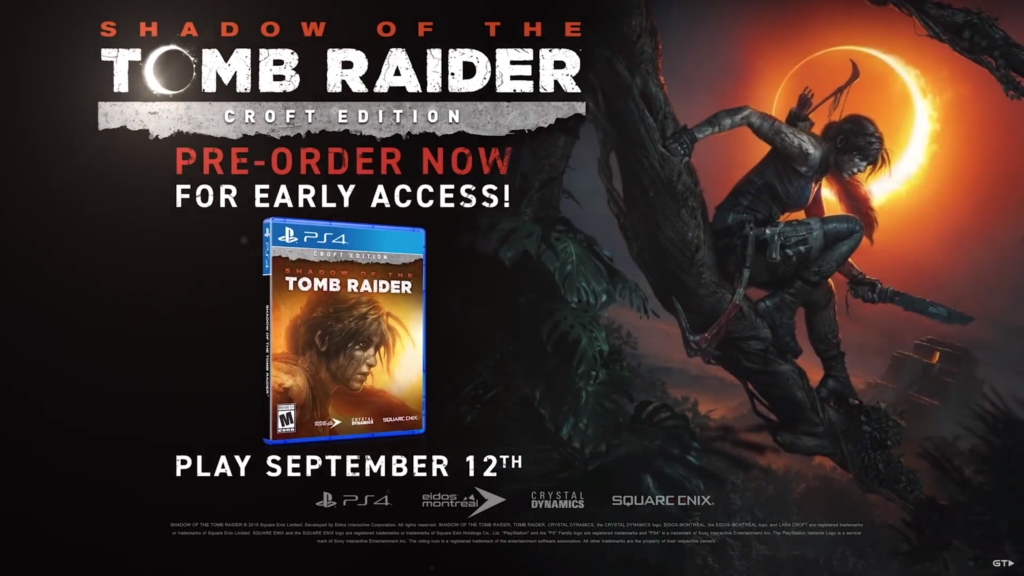
As you noticed, I didn’t share a magic recipee to make the best end slate. Since all projects are different, their needs are different and so must be the end slate. By asking yourself what is the mission of the trailer, you’ll be able to consider what you need to show and what is optional. The common error is to show too many things. There is always a sweet spot when it comes to the amount of content and the design proper to it. When you aren’t certain of the informations you should show, include your logo, the state of the game/release date and the platform(s). You can’t really do harm to yourself with this. From there, try and add new content and change the design to make new versions! Never safe from a great surprise.


