16 Mar Readability:SHOW CLEAR INFORMATION FOR YOUR PLAYERS

Trailers have pretty much two main missions. Which are to provide information and galvanize the viewer to play your game.
Although giving information seems quite easy, there are many pitfalls which we can fall into. Being understandable becomes difficult when you also have to make it enjoyable.
The first mission is to keep things simple enough that your audience can understand if they might be the targeted audience. Video games, like movies and musics, use genre and codes. The spectrum is immense, while you might enjoy games with strong storytelling, you neighbour would maybe choose to play League of Legends over Limbo.
Trailers usually start with establishing shots and basic story, this help to build a common ground to work with. From showing the overall art design with the environment and your character, you can then develop the mechanic and direction of the game. Viewers will develop an attachment to the game if they like what they see, and they need context.
This is pretty much how we build a structure. You don’t throw random information at viewers and expect them to understand it. Essentially, comparing it to the learning process, you slowly guide them, to the point they have enough information to connect the dots together. Make sense from each new information you add, like building a story.
Assimilating information requires a little bit of brain power to make sense of the whole. In trailers, you don’t have much time so you want the flow of information to be extremely clear in a fast and efficient way. Forget the endless 15 seconds clip that doesn’t show anything.
Some information are more important than others, since they represent the global concept that helps smaller information to result from them. Like a pyramid, the base is first used to build and import new, more difficult knowledge. This is something you see in-game tutorials, where you learn to use the A button, then B button and then A+B+A combo. Information connects together.

There is usually a pit between what developers think should be shown, and what players need to know and what they wanna see. While a developer obviously has more knowledge about his own game, (s)he is so close to it that it can act as a blinder to the marketing process. I think you need extra time to consider what you want to achieve beforehand and keep the flow of information to accomplish your goal.
In the past years, a new trend of introduction has been developed in trailers. The first ~5seconds are basically a tiny sneak peek that have high energy, like a climax. This acts as a hook and it is quite powerful because you have a glimpse of what you can expect, without getting the whole. You crave for more and keep watching the whole trailer if you enjoyed the early hook.
Establishing informations through visual storytelling is an easy way to use our common cinematic knowledge. We watch pictures since our birth and can make assumptions from specific stagging.
This is one of the reason you don’t want any User Interface on your trailer, because they are like visual noise and most of the time, aren’t necessary at all. Your gameplay is king for your potential audience, although your interface might be well designed, that’s not that much important for a first glimpse.
Trailer with hardcore music with big guns effects is obviously about a fast-paced weapon-based game. You can expect the game to be violent and have a lot of fun shooting monsters. A game using more storytelling would maybe use a trailer with slower music and few voice lines to convey emotions and information.
Some games are very heavy on the use of sounds, which could be for a mechanic or the necessity to use sound as information. If your game join this group, you need to be thoughful about the structure of your trailer. How can you showcase the importance of your mechanic, through distinct and slick music and sound design.
In film school, we quickly learn that sound is as important as video, if not more. How many times did you look at a video with clever sound design and high quality, but no that much of impressive visual ? This is not an issue.
However, we can’t forgive bad audio quality, music overwhelming the voice line or sound effects that don’t match what we see, it is a turn off for everyone, especially the sensible person to audio. A simple example is how everyone enjoys great music and do their best to experience it. We prefer to spend $15 on mid-range earphones than cheap $1 earphones that will transform your favourite music into a nightmare.
The principle “Show what you tell” is the easiest way to make a structure and inform the viewer. Hugely used in indie trailers, for a good reason: it is easy to make and allow you to provide efficient information with no effort. Your game is about a
The main problem with title cards is how the viewing retention can be crushed, if you don’t design them correctly and have too much of text, you’ll end up with bad surprises. Nobody is interested in reading too much in a video, they are watching a trailer to be entertained from a melting pot of images well stitched together. So when you plan to make title cards, don’t put a whole sentence in there to read. It should be read in 2seconds without efforts.
What would you prefer to read in a tight 90seconds trailer?
-4seconds of “Follow the path of surgeon Kwuz and his amazing journey to saving the life of dozen of sick people with cancer“
-2seconds of “Cut, stitch and operate cancer”

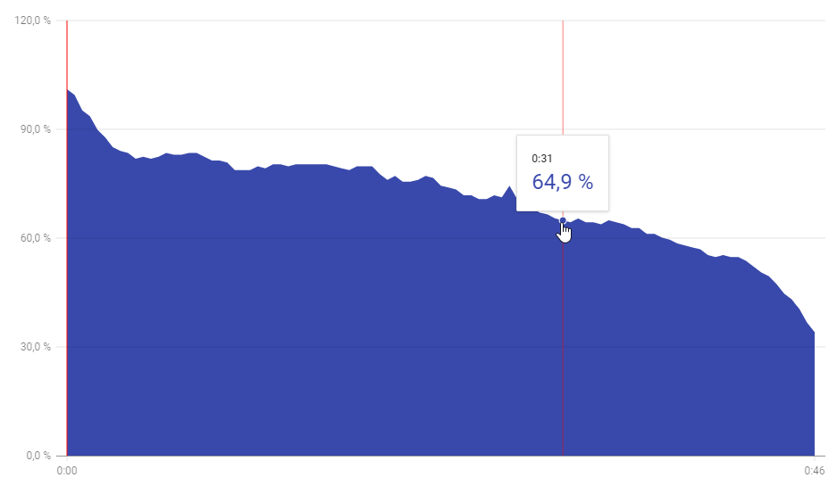
Viewing retention graphs can be view as interest indicators. When you have a big drop in the curve, it is usually a way to say: This is not very entertaining to watch. Learn from your mistakes, by understanding what your audience like to see and what throw them off.
Although the type of trailer pretty much gives away what the player can do at this point, having clear call to actions are necessary to empower the viewer to do something.
(Release trailer = Game is out = Go to the store page)
(Announcement trailer = Game is under development = Follow our social media and keep in touch)
Since a trailer is already an advertisement, most viewers won’t stand having call to actions or supplementary advertisements over the video, during the playback. Wait for the end to add every bit of information you wish to share. This is why in 99% of trailers, an end slate with all the informations packed together are present. The design must be readable,

Most trailers ends up on YouTube. The description you can add can be very long but only 3lines will be constantly visible under the video.
Those 3 lines are crucial when it comes to what you wish to convey to the viewer. Either you can display all your links (website, storepage, social medias…) or might wanna write the pitch of the game. In my opinion, both is a great way to provide information and marketing utility. A small description and one link of your choice.
Recognize that your identity, the way people see you and define you (branding), comes from a lot of small details stitched together in the mind of the audience. Despite being “only a description” or “a useless end slate”, it is one more tool to achieve your objectives and position yourself.
Doing your best to convey all your game is about, is a hard task. Being thoughtful about your intention and what you need your audience to know is primordial. Every shot provide information to the viewer, it may be information about your gameplay, the quality of your game, the team behind it, how buggy it seems.
Although the readability of a trailer comes from the synergy between all the moving parts, it all start with intention and what you are looking to accomplish.


